No more housing hassle: Streamlining the housing search process for UC Santa Cruz students
On top of endless classes, grueling homework assignments, and nail-biting exams, housing insecurity is one of the biggest stressors for university students. For UC Santa Cruz students, potential housing opportunities are dispersed across endless websites and Facebook groups; and on top of unreliable roommates and the Santa Cruz housing crisis, finding a place to live for the school year can feel next to impossible.
Slug Housing tackles this problem by compiling listings and roommate requests in one place and creating an all-in-one platform that students can use to discuss housing opportunities and create listings for roommates in the Santa Cruz area. To achieve this, I worked in a group with three other designers.
Timeline
Responsibilies
Jan ‘21 - Mar ‘21
UX Design, User Research, Wireframing, Prototyping
1/7 Problem
In the midst of a housing crisis, students struggle with finding a secure place to live
Finding housing in the Santa Cruz area is hard enough with the housing crisis, but it is even more with limited on-campus housing and nontransparent landlords who are unwilling to rent to students. Trying to find the a secure place to live for the school year is like navigating a labyrinth across multiple different websites.
2/7 Research
Existing housing resources are not optimized for students’ experience
Our team made flow analysis diagrams to map out how a student looking for housing would navigate our competitor websites Zillow and the UCSC Facebook housing group.
Competitive Analysis: Flow analysis
For Zillow, the layout and filtering feature made it easier to sort through listings, but there were quite a few steps taken in the beginning of the user experience, such as specifying location and desire to rent, that is not applicable to students. Additionally, Zillow has no features to allow for finding roommates and subletting rooms, both crucial in the housing process for many. The Facebook group on the other hand does offer these opportunities, but being a group on Facebook and not a dedicated website requires the user to do a lot of organizing work themselves.
Competitive Analysis: Scenarios
We used scenarios by creating a persona of a student who is looking for housing, and would use our competitor websites Zillow and the UCSC Facebook housing group to find roommates and housing.
We wanted to highlight the difficulty navigating housing websites that stems from lack of post sorting functions, lack of resources and support during their housing search, and the difficulty finding listings that are accommodating for users.
2. Students lack support and resources related to housing
3. Difficulty finding listings that fit users’ specific needs.
Top pain points
1. Navigating different listings is confusing and disorganized
Our team used the IDEO methods Competitive Analysis and Scenarios to get a much deeper understanding of the needs of students as well as the pain points in the current housing situation.
1
3/7 Design Goals
Create an all-in-one housing resource for students
Our goal was to think of ways to incorporate functions specific to a listing site like Zillow into a digital community like the UCSC housing Facebook group.
Supporting design goals
Design website features that are organized and easy to navigate
2
Connect users with other UCSC students looking for housing
3
Ensure that users are able to find listings that can accommodate their specific needs
4/7 Ideation
Prioritizing organization, social, and search functions
To synthesize our design goals, we created an affinity diagram to visualize our main ideas versus the smaller details to plan our prototype. We found organization, social, and search to be our key points of focus for the next steps.
Low fidelity prototype
All team members created paper wireframes individually, then met to compare and synthesize our ideas. Our wireframes shared some features, which helped nail down the key things we wanted to focus on and narrow down the specific interactions we wanted our users to have.
After discussing all our designs, we decided to focus on navigation through listings, through rooms and profiles, and through available rooms since they were the most important to our users’ needs
5/7 Validation
Decluttering the interface
We tested our low fidelity prototype by user the Role-Playing IDEO method where two of our group members went through our prototype as if they were a student using our design to allow us to think about our design in a different perspective.
Through user testing, we found that there were a number of features that were redundant and a source of confusion. Specifically, we decided to remove the “Profiles” and “Available Rooms” tab since their functions could be achieve through the other tabs.
Low-Fidelity Prototype
6/7 Iteration
Prioritizing Simplicity
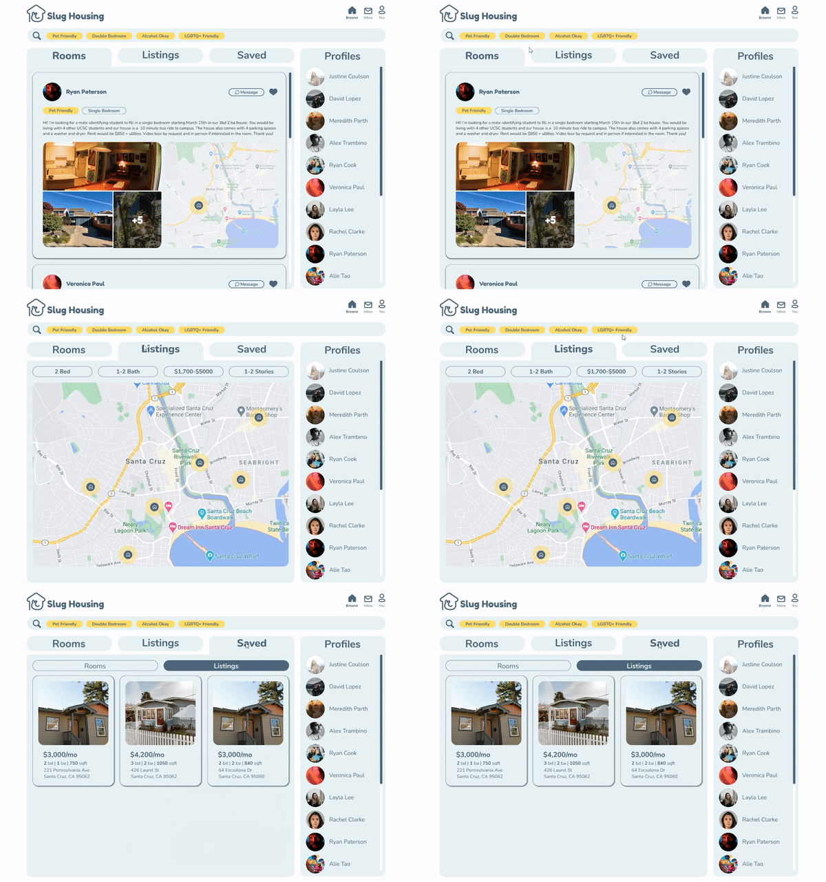
We consolidated our findings from user testing to create a high-fidelity prototype by simplifying the layout to two tabs of posts and a saved tab. The three main tabs and the flexibility of filtering and messaging addresses all of the housing needs students may have, and the websites exclusivity to students would ensure smooth interaction with potential landlords.
7/7 Visual Design
Giving the prototype a facelift
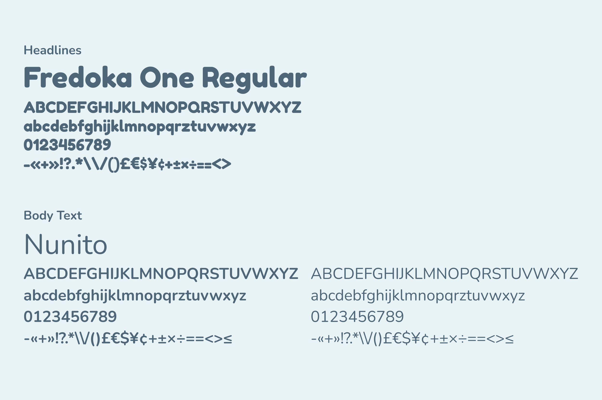
This project prioritized the the research and strategy steps of the design process, so after the conclusion of this class, I decided to continue the project afterwards to reimagine the design prototype, but with a focus on the visual design and branding of the website.


